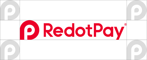
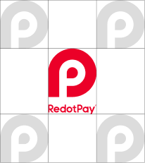
Everything you need for RedotPay brand - official logos, colors, and brand assets designed for press, partners, and creators.
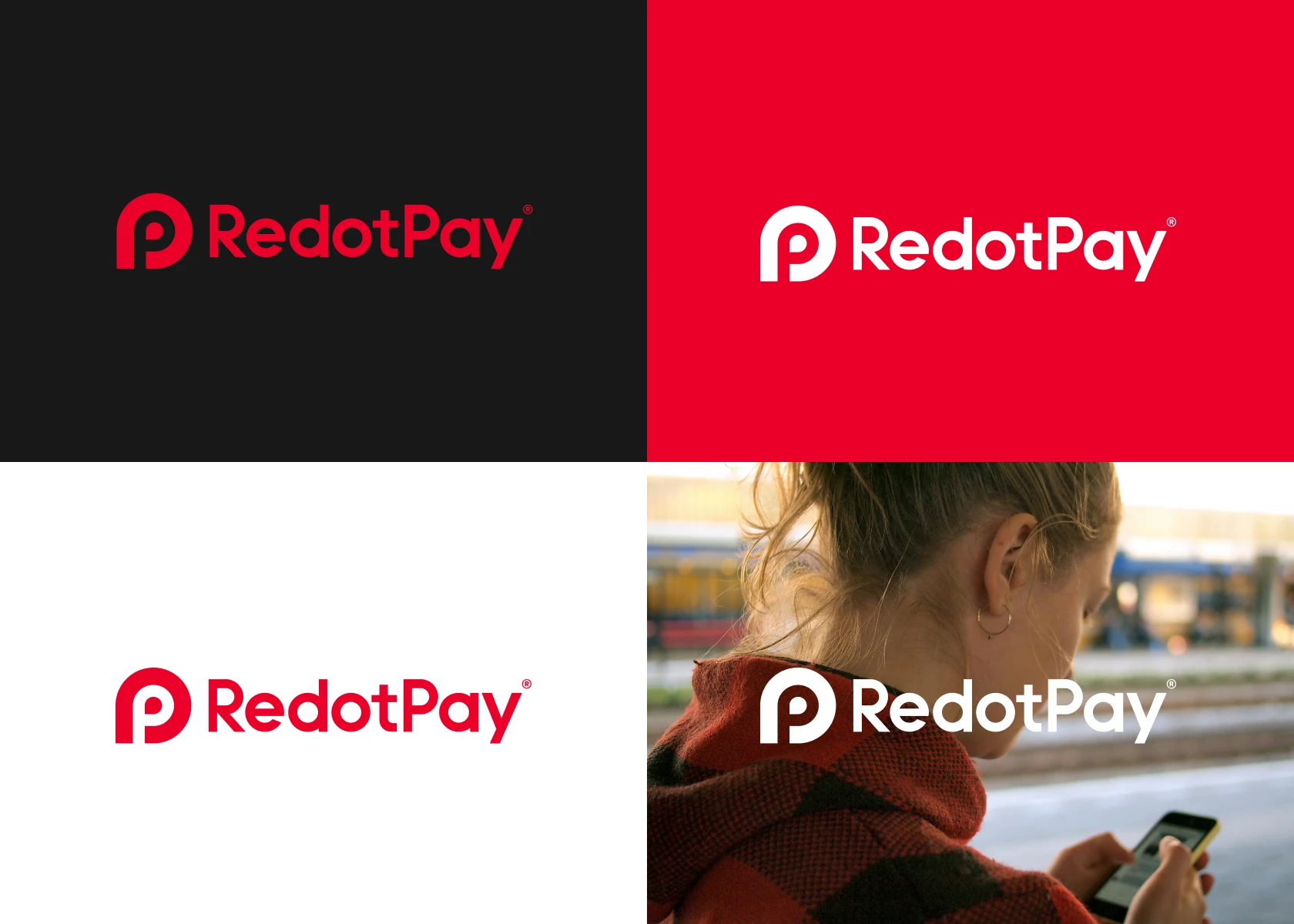
The logo can be presented in red, white, or black on any background that offers strong contrast and keeps the mark clear and legible. Please do not redraw, modify, or change the proportions of the logo. Please retain both the icon and the wordmark, where possible.
Clearspace is the protective area that surrounds the RedotPay logo and keeps it clear and visible across various formats. Use the height of the “P” icon as the minimum clearspace on every side whenever the logo appears. No text, graphics, or other logos should enter this safe zone, ensuring the mark remains the focal point in any layout.